This is the next post in a multi-part series about self-publishing your eBook. Posts include:
1. Selling Your eBook Without a Publisher, Part 1: Introduction
2. Selling Your eBook Without a Publisher, Part 2: E-book Formatting (this post)
3. Selling Your eBook Without a Publisher, Part 3: Book Covers
4. Selling Your eBook Without a Publisher, Part 4: Amazon.com
5. Selling Your eBook Without a Publisher, Part 5: Smashwords
6. Selling Your eBook Without a Publisher, Part 6: Scribd
7. Selling Your eBook Without a Publisher, Part 7: Lulu
8. Selling Your eBook Without a Publisher, Part 8: Selling Strategy
Let's talk about e-book formatting.
From looking at the Amazon Kindle Publishing Guidelines document, you might quickly think you need a masters degree in publishing and a whole lot of designer talent to pull this thing off (I did). Not true at all. My experience thus far has been that getting an e-book ready for publishing is really a pretty painless process. The retailers I'll be talking about in later posts accept a variety of formats, and where the expected format is proprietary (like for the Kindle), tools are provided to do the conversion.
Now, I'm not a designer in any sense of the word. So I'm not going to even try giving that sort of advice. But what I can do is point out some simple tips as well as resources that helped me format my e-book. The latter will be a running list; I'll add to it as I find new resources, and intend to use it as reference information myself.
As far as some basic guidelines, here's a few things I've run across:
1. Keep it simple
Don't go crazy with fonts, font sizes, and the general layout. Keep it simple. You want your e-book to be readable on as many devices as possible. The best first step in guaranteeing that is to not go crazy with styling.
2. Use a book cover
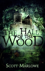
This one is HUGE in my opinion, mainly because I'm one of those people who uses the cover as a gauge of the overall quality of the work. Turns out coming up with a professional looking cover is not that difficult as long as you have some skills of your own or are willing to pay a reasonable amount of money for a professional to work their magic. I'll touch on this subject some more in the next post in this series. For now, though, here's the cover I used for my fantasy novel, The Hall of the Wood:
3. Do have a title page
Keep it basic: the name of the book and the author's name, possibly with some artwork if you have it.
4. Do have an 'other books' page
If you have other books available, why not let your readers know about them? Remember, too, that when you do release new e-books, go back and update your previously published ones with the title of the new book. One of the nice things about electronic publishing is that it is not immutable.
5. Do have a copyright page
Some online publishers/retailers require this. It's best to explicitly declare your copyright and/or licensing. If you're a resident of the United States you're automatically covered under standard U.S. copyright law, but something I'm considering is also releasing my work under a Creative Commons license also, similar to how I protect my blog posts.
6. Do have an attribution page
Use this page to thank anyone who helped you along the way.
7. Do have an acknowledgments page
This one is optional, but if you want to include a paragraph or two thanking various people…
8. Do have a quotations page
Another optional one, but some authors like to include a short quote as a lead-in to their content.
The order of the above pages varies. Right now, I'm reading Boneshaker by Cherie Priest, and the order I see is: praise/quotations, other books by author, title page, copyright, dedication, an acknowledgments page, a map of Priest's vision of Seattle, an excerpt from a fictitious history text, another title page (this one with just the name of the novel), and, finally, the content.
That's it for tips, and that about wraps up this post.
I'll leave you with a short list of styling resources I've discovered:
Smashwords Style Guide
Mark Coker, the founder of Smashwords, wrote this free e-book on how to style your e-book prior to publishing with Smashwords. At twenty pages, it's a fairly quick read, but has some good information in it. While intended as advice for publishing with Smashwords, the information is general enough to apply regardless of where you decide to publish.
Scribd's "Preparing Your Content"
Scribd is another online publisher which I'll be talking more about in this series. This forum entry has some good information about page size, fonts, and a tip I found especially useful regarding using text on your book cover image.
Amazon Kindle Publishing Guidelines
The first so many pages of this document are a worthwhile read, but when it starts to look like Greek it's time to shut'er down and move on. Too much low level detail for me, but some good stuff early on.
Join my reader's group and get The Hall of Riddles (An Alchemancer Prequel) and The Assassin's Dilemma (An Assassin Without a Name Prequel) as a welcome gift.